25 Mar 2011, by Eric
I spoke with Ken Levine, television writer and Mariners' broadcaster, last week for an article I'm writing elsewhere. The conversation turned at one point to scorekeeping, and he shared this tidbit on Vin Scully:
Normally I can look over somebody's shoulders, I can pick up their scorecard and I can kind of figure it out. With one exception – Vin Scully. He's got lines and dots and stuff. I have no idea. You need Navajo code breakers to figure out Vin's scorebook. I have no idea.
Scully, Levine said, also has the unfortunate habit of throwing his old scorebooks away. (Ernie Harwell, on the other hand, kept everything).
24 Mar 2011, by Eric
In another fit of list-making compulsion, Ted sent me an email yesterday with some major league player jerseys he would actually wear. His impetus was what he called the "wave of fashion and design" this blog is riding. He sees no reason to stop, and neither do I. After all, Spring Training takes a big turn toward the boring after the St. Patty's day uniforms get stored up for next year.
The list just came out of Majestic's top selling jerseys for 2010. No big surprises. But not a very P&P set of players.
Sure Josh Hamilton is on there, with his crazy arm tattoos and rock n' roll past. Sure Tim Lincecum is on there. But Jeter at no. 1 offers little in the way of excitement. So here we bring you a short jersey-wearing draft.
Eric: John Rauch
I've always wanted the chance to mention John Rauch on this blog. For one, he's extremely tall. For another, he has a cool neck tattoo that I haven't looked at closely, but from his perch on the mound distinguishes him as both a badass and a dude with better aesthetic taste than most of his fellow ballplayers.
Ted: Jarrod Saltalamacchia
Stitch-for-stitch, this jersey is gonna get you the most value. This recommendation is the jersey equivalent of the little per-ounce price they put on the shelf labels at the supermarket. Ten pounds of cheese is gonna save you a bundle on the unit price. Same thing for Salty.

Eric: Milton Bradley
Once, I was merely a Dodger fan supporting his team's center fielder. Now I am the baseball blogosphere's most avowed Milton Bradley apologists. Also, it's sure to be a conversation starter. As in "hey, why are you wearing a Milton Bradley jersey?" "Because he's complicated. You should read my blog."
Ted: Jose Valverde
Papa Grande is a real character, with a serious array of rituals and a joyfully haphazard windup. And what's a jersey for if not to celebrate the game's entertaining and outlandish personalities. Acceptable replacements: Big Papi, Brian Wilson, Nick Swisher.
Eric: Lance Berkman
I'm surprised Ted didn't chose this one, as Berkman is his favorite player. I just like guys who seem to be having more fun than anybody else out on the field. Would have to be an Astros jersey though.
Ted: Bryce Harper
Yes, this could be the Mark Prior jersey of a few years from now. On the other hand, I could be getting in on the ground floor of some serious stardom. This jersey choice is the angel investment in the early days of a juggernaut. You've seen The Social Network, you know the deal.

Eric: Andre Ethier
Because he was once traded for Milton Bradley
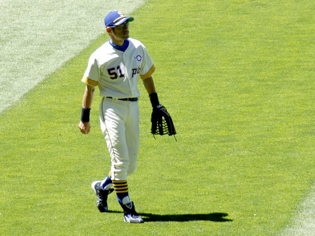
Ted: Ichiro
His $1.3 million contribution to Japan's relief efforts is just the latest evidence that Ichiro is operating on another level. You might as well jones off of his vibe (see BIRG on Ron Kaplan's bookshelf) by wearing his jersey. Bonus: it's got his first name on the back, which is so very European football.
Eric: Tim Lincecum
If he played for any other team, I would likely own a Lincecum jersey t-shirt already. He's the only UW alum in the league right now, but beyond that he's a likable character. Character.
23 Mar 2011, by Ted
 The podcast is back!
In this latest episode, Eric and I discuss alternate scorekeeping ideas, the best and worst cap design list, and the most stereotypical representatives of each position.
We're still hammering out some details, like getting the podcast back in the iTunes store, but for now you can subscribe in iTunes yourself, or via any RSS reader. Just use this feed url:
http://feeds.feedburner.com/ThePitchersAndPoetsPodcast
In iTunes, just click Advanced > Subscribe to Podcast, then enter that url, and you're in business.
To download the file directly, right click and Save As:
http://pitchersandpoets.com/podcast/PnP_025.mp3
23 Mar 2011, by Ted

Pitchers and Poets contributor Ben Lyon, a lawyer in Chicago, pipes up this week with a look back in time, to several of the great debates that have shaped the course of history.
These are heady times for the sports military industrial complex—the ground is littered with forgotten college basketball teams, the opening filibusters over who will get the #8 seeds in the NBA and NHL playoffs are slowly emerging, and best of all, labor strife in the NFL and the NBA is propelling the insurgent LaCrosse, Wisconsin Assessor candidacy of Mike Golic. Faux-outrage is at its zenith in early March.
But what of the pointless sports debates of previous generations? In our rush to find the next menial debate to fill the final 90 seconds of Around the Horn we fail as citizens if we don’t recognize when a seemingly endless debate is finally settled. Will America ever agree that Bobby Jackson deserved to be NBA Sixth Man of the Year in 2002-2003?
Doubtful, as too much blood has been spilled, and the wound on our body politic remains too fresh.
And of course who amongst us can forget the fateful summer of ‘92: Young Cleveland Indian second baseman Carlos Baerga has been selected to the All-Star team as a last-minute injury replacement. The upstart Baerga is selected over avuncular Detroit Tiger first baseman Cecil Fielder. Despair commences in certain quarters, with ESPN Analyst Peter Gammons channeling his best John C. Calhoun impersonation when he says, “Baseball is trying to attract fans! And a lot more people would prefer to watch Fielder than Baerga!!”
(If emoticons had been invented at this point, Gammons would have used the following: “ :< ”)
So who did deserve to be in this All-Star game? Thankfully, the Baseball Writers Association of America is here to serve as our philosopher-king and settle this issue. At first glance, it appears that Gammons was wrong. Baerga (pinch hitting for Roberto Alomar Jr.) went 1-1 in the game; using Moneyball Sabermetics, we can calculate that at this pace, Baerga would have gotten a hit every time for an average of 1.000! Fielder did finish 9th to Baerga’s 11th in the 1992 MVP vote; however, they both finished behind Mike Devereaux, thus invalidating this as an argument.
Fast-forward to this winter, when the wise heads at BBWAA finally ended all debate. Carlos Baerga—he of 3 All-Star games, a league leading 444 Assists in 1995, and six triples in 1993 (good for 9th in the AL)—received 0 Hall of Fame votes. In 2004, Cecil Fielder received 1 Hall of Fame vote. By this indisputable math, the career of Fielder is infinity times better than that of Baerga. It therefore goes without saying that a player who is infinity times better than another deserves to make it into the 1992 All-Star game as an injury replacement.
In 1992, a grave injustice was committed. In the winter of 2011, this injustice was definitively rebuked--well for all except Jay Bell who hit only .264 in 1992 but somehow got 2 HOF votes!
21 Mar 2011, by Ted
Last week I ranked my best and worst MLB caps of today, stirring up some good conversation. Some of the best input and discussion covered the worst hats, or at least hats low on the totem pole. There was also some good discussion of old school hats, and the venerability of classic designs.
Those last two points got me thinking: was there something inherently better about the old designs? There are obviously lots of great ones, but I wanted to find some heinous caps from ages past. I succeeded. Here, with very little scientific criteria and in no particular order, is a list of some of the worst MLB baseball caps that history has to offer:
1926 Chicago White Sox

The White Sox have made some bold fashion choices over the years. Here, I can see the concept: we'll cross the socks as though they were swords on a crest. But there's something unnerving about the reality of it: two socks standing stiffly remind me of the recent Seattle Mariners commercial in which Jason Vargas presents a couple of lucky socks that have hardened into nauseating freestanding boots. Check out this cap on a player, who I think is Spencer Harris.
Early 1930s Boston Red Sox

Let's get these preposterous sock hats out of the way early, shall we? This eye-burning red-striped number continues the theme of unnaturally stiff, phantom-footed socks. In this photo, Joe McCarthy sports the cap, which looks like an "L." So it's a cap that doesn't look like what it wants to, which takes the team name too literally, and doesn't even look like the misguided object it's supposed to. It doesn't seemed to have lasted long.
1940 Pittsburgh Pirates
 The white stripe cuts across the sad figure of this cap like a sash across the wide waist of a lowly Victorian baronet who's been begrudgingly invited to a party above his nobility.
1969 Seattle Pilots
 The idea is a clever one: make the baseball cap look like a captain's hat like this fellow is wearing. It's also a bold use of the bill, which I can't recall seeing elsewhere. That said, the use of the bill with the laurel leaves and the use of the terribly ungraceful bar running across the bottom of the upper combine to create a heinous panoply of ugliness. In action, sort of, on this Sean Connery lookalike.
The last word on the topic: even Ichiro can't make this cap look good.
(date corrected, thanks ralf)
2000 Anaheim Angels
 The "dark, dark Disney era," as John called it in the comments of the cap rankings post. The Angels "A," which is usually decorated with a subtle gold ring, is bear hugged in this design, clung to desperately by a co-dependent angel's wing that could've been plucked from the main character in an epic cartoon movie. The "A" looks more like a hieroglyphic representation of a playground slide than a letter. Fly away, ugly design.
2000 Tampa Bay Devil Rays
 This devil of an ugly cap was hard to track down, and it may be some kind of alternate, which would, I suppose, exempt it from serious conversation. This image, though, of Wade Boggs seems to suggest it was a regular cap. The gradient neon coloration, from pale aqua to iridescent teal to sick yellow, qualifies the Hypercolor people for some royalties.
Conclusions
This survey suggests that, while the predictable eras yielded their fair share of fugly caps, antiquity alone doesn't exempt any cap from terribleness. The argument, therefore, that we like a hat just because it's old doesn't hold water.
Also, this list shows that with great risk comes great failure. The hats on this list are bold attempts to change the paradigm of hat design, and to use graphic design to rethink the way ideas can be represented on the forehead. For every bold and great cap design, like the busy late-70s to early-90s Blue Jays design and the Brewers' much-heralded MB logo cap from the same time period, there are twenty missteps and eye sores. If anything, I applaud these blunders, and praise those who fail greatly. Except for Disney.
Final note: For epic amounts of uniform data of all kinds, check out Chris Creamer's SportsLogos.net. It's crisp, clean, and epic.