MLB Caps: The Worst of All Time
21 Mar 2011 by TedLast week I ranked my best and worst MLB caps of today, stirring up some good conversation. Some of the best input and discussion covered the worst hats, or at least hats low on the totem pole. There was also some good discussion of old school hats, and the venerability of classic designs.
Those last two points got me thinking: was there something inherently better about the old designs? There are obviously lots of great ones, but I wanted to find some heinous caps from ages past. I succeeded. Here, with very little scientific criteria and in no particular order, is a list of some of the worst MLB baseball caps that history has to offer:
1926 Chicago White Sox

The White Sox have made some bold fashion choices over the years. Here, I can see the concept: we'll cross the socks as though they were swords on a crest. But there's something unnerving about the reality of it: two socks standing stiffly remind me of the recent Seattle Mariners commercial in which Jason Vargas presents a couple of lucky socks that have hardened into nauseating freestanding boots. Check out this cap on a player, who I think is Spencer Harris.
Early 1930s Boston Red Sox

Let's get these preposterous sock hats out of the way early, shall we? This eye-burning red-striped number continues the theme of unnaturally stiff, phantom-footed socks. In this photo, Joe McCarthy sports the cap, which looks like an "L." So it's a cap that doesn't look like what it wants to, which takes the team name too literally, and doesn't even look like the misguided object it's supposed to. It doesn't seemed to have lasted long.
1940 Pittsburgh Pirates
 The white stripe cuts across the sad figure of this cap like a sash across the wide waist of a lowly Victorian baronet who's been begrudgingly invited to a party above his nobility.
1969 Seattle Pilots
 The idea is a clever one: make the baseball cap look like a captain's hat like this fellow is wearing. It's also a bold use of the bill, which I can't recall seeing elsewhere. That said, the use of the bill with the laurel leaves and the use of the terribly ungraceful bar running across the bottom of the upper combine to create a heinous panoply of ugliness. In action, sort of, on this Sean Connery lookalike.
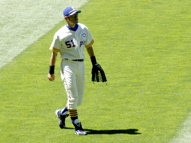
The last word on the topic: even Ichiro can't make this cap look good.
(date corrected, thanks ralf)
2000 Anaheim Angels
 The "dark, dark Disney era," as John called it in the comments of the cap rankings post. The Angels "A," which is usually decorated with a subtle gold ring, is bear hugged in this design, clung to desperately by a co-dependent angel's wing that could've been plucked from the main character in an epic cartoon movie. The "A" looks more like a hieroglyphic representation of a playground slide than a letter. Fly away, ugly design.
2000 Tampa Bay Devil Rays
 This devil of an ugly cap was hard to track down, and it may be some kind of alternate, which would, I suppose, exempt it from serious conversation. This image, though, of Wade Boggs seems to suggest it was a regular cap. The gradient neon coloration, from pale aqua to iridescent teal to sick yellow, qualifies the Hypercolor people for some royalties.
Conclusions
This survey suggests that, while the predictable eras yielded their fair share of fugly caps, antiquity alone doesn't exempt any cap from terribleness. The argument, therefore, that we like a hat just because it's old doesn't hold water.
Also, this list shows that with great risk comes great failure. The hats on this list are bold attempts to change the paradigm of hat design, and to use graphic design to rethink the way ideas can be represented on the forehead. For every bold and great cap design, like the busy late-70s to early-90s Blue Jays design and the Brewers' much-heralded MB logo cap from the same time period, there are twenty missteps and eye sores. If anything, I applaud these blunders, and praise those who fail greatly. Except for Disney.
Final note: For epic amounts of uniform data of all kinds, check out Chris Creamer's SportsLogos.net. It's crisp, clean, and epic.